Now that the jacket for Ranger Martin and the Zombie Apocalypse is complete, I can concentrate on my golf swing, cracking open a bottle of champagne, and getting my yacht tuned-up for a mid-September Caribbean jaunt of sorts. Ha, as if. I’m going to be busy the next few months more than usual in preparation for my book’s release. So, I thought before heading into the unknown, for Monday Mayhem I’d give you a tour of my book’s jacket. It’s an interesting story. I hope you’ll like it.

A few months ago, I complained to my wife, well, more like explained, I hadn’t come up with any concept art for my book’s jacket. Being the practical person she is, she suggested I work through my 14,600+ photo collection and find something in there. My initial feeling was positive. Something I had shot years gone by must have some semblance of my book’s concept. I didn’t worry about it much, but it was in the back of my mind as something I needed to do.
In the meantime, my wife also asked me if I had any ideas of what I wanted on the jacket. I answered her with the very clichéd, overused statement, “I’ll know when I see it.” In fact, that’s exactly what I thought.
Anyway, as the months went by and I sifted through my vast collection of digital photos I had taken over the course of nine years, I was finding I didn’t see what I was looking for. I had a very specific idea, but nothing really stood out as “the” photo I wanted to use as a representation for the book.
Eventually, I spoke with one of my friends about the problem and over a period of a few weeks, the subject would come up over tea. I would hum and haw and he would placate my need for resolution of my creative plight. He’d ask what I was looking for and I’d say, “I’ll know when I see it.”
This whole thing between my wife, my photos, my friend and I continued for months.
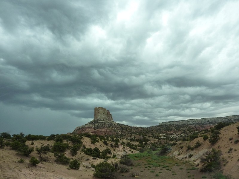
 That is until one day, my friend and I were having tea and talk surfaced of his trip he’d taken last year to Utah. I thought for a moment and asked if he had photos of that eventful journey. He did. I asked if I could have a look at a few. He asked how many? I said a handful; I was looking for those Utah mountains with the flat tops.
A few weeks later, he gave me an assorted collection of photos, and as I perused them, the seventh photo in the lot jumped out at me. Seriously, the “I’ll know when I see it” statement turned into “this is the one” statement. I had no doubt I had the right one.
And right there, within the span of seconds after seeing it I described to him how I would crop, darken and perhaps add a few elements to the photo to make it more dramatic in order to convey the book’s theme. The assessment went that fast.
That very weekend I spent playing with the photo exactly as I’d described to my friend. I didn’t deviate one bit from the plan. I implemented everything I said I was going to put in it and then some.
When I showed it to him a few days later, his jaw dropped to the floor. He couldn’t believe it was the same photo. Hey, I couldn’t believe it was the same photo.
So that’s how the book’s jacket came to be. I hope you found that story just as interesting to read as it was for me to write.
RANGER MARTIN AND THE ZOMBIE APOCALYPSE, on sale October 22.
Are you curious about anything I may have not mentioned about the concept art?

I have spoken and interviewed a few authors. All agree that the old phrase that “you can’t judge a book by its cover” may apply to some situations, it isn’t the case for actual books. The right cover that looks professional, is eye catching, and looks professional is key to getting potential readers to make the decision to purchase the book. Your cover meets all of these criteria and looks great. Your comment that you will know it when you see it is exactly what was needed. I am looking forward to your book release.
Thank you for sharing your story behind the cover art.
-jb
When it’s right, you just know. 🙂
Got it marked in my diary.
All of the pieces are falling into place! Great cover- I wish you every success with your book launch!
That’s an awesome story. I love how you would just know it when you saw it. I sometimes have that gut feeling too and you have to trust it. Way to go!! I love the addition of the green to the picture. I can’t wait to read your book! I have another friend who loves zombie books too, I would love to share it with her. ~Gina
Both the photo and the cover are awesome. I admire your being so hands-on about this. Have you ever studied art or design?
I couldn’t for the life of me think of a concept for my cover, so I hired an artist and left it all up to her.
Thanks! I’ve never studied any of that, Sonya. I don’t know if that’s good or bad. I just know what looks good…at least for me!
I think the concept art was easy because I had it in my head but I only needed the right pic. My FB page has a bunch of concept covers I worked on but wasn’t exactly what I wanted for the book’s jacket. Overall, it’s a fun process and I’m looking forward to the book’s release! 🙂
“take that” My fingers have a mind of their own.
Looks really good! It is always nice to see a dream that actual form.
Love the cover, Jack! What a nice story and so cool your friend gets to play his part in your book. I want photoshop for Christmas and an ipad now whose kidding. Have fun on your yacht! 😉
I left him shocked! And yeahy for Christmas, whose not looking forward to that? 😉
I love behind the scenes stuff like this! Very cool. Thanks for sharing 🙂
Jack, congratulations are in order. I’m jealous of anyone right now able to finish a full length book. I look forward to reading more. I’m assuming it’s going to be on Kindle?
My impressions of the cover? I like the picture a lot. The green ray hitting the rock is very effective. I’m not a huge fan of the font however–just from a critic’s perspective, not from a creator’s (I have my own problems with fonts like making them readable)–particularly how it looks in the title. Tarl might have a good suggestion, or you may experiment a bit more with other fonts and font effects to get it just right.
Overall, though, the book looks cool, and I’ll keep a lookout for it. Thanks and cheers.
One thought on the text effects – the glow around the text blurs the sharp lines of the letters. If you are trying to separate the letters from the background, a dark shadow would work better (or a sharp light shadow with no blur).
I enjoyed the behind the scenes glimpse into your process. I have done the same thing with my Man Behind the Curtain posts.
Thanks for your feedback, Tarl, I appreciate it. The effect is a glow. My intention is for people to look at the title and rub their eyes to look at it again. This is how people remember… 😉
If it was intentional, then I leave it to your creative discretion. I just did not want it to be an oversight.
All good, Tarl. No worries! 🙂
I took your advice, Tarl. I minimized the glow after seeing how the effect looked when reducing the cover to smaller sizes. Everything did render blurry!
Thanks for your contribution!
How cool! What a great story-behind-the-cover-art! 🙂
Looks great, Jack! Does it make it seem more real somehow?
Hey, Jess! Actually, it’s been real to me since I first started this adventure. The events are only catching up now with my plans! 😉
October is right around the corner! So happy for you and can’t wait to read the book 🙂
Thanks so much for your support, Jess! 🙂
Keeping it short: Nice story, awesome cover, looking forward to 2013-10-22 🙂
Looks good!
All of my photos of Utah are sitting in slide carousels. At least they are all Kodachrome so (I hope) they haven’t faded.
I keep saying I need to get the scanned … and I will … but it is expensive and/or time consuming.
October 22 … I’ll be one of you first customers!
Loving the concept art. It’s very eye-catching and the story behind it was fun to read. People don’t usually talk about the story behind their cover art.
Thanks, Charles. I thought I’d try my hand at a feature related more to movies than books.